
I have found when taking portraits, I really prefer to not have the sky be in the background. So often the sky contrasts with the ground in a very distracting way. Are there exceptions, sure. But generally speaking, I like to leave the sky out.


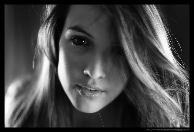

Although it has been said "we are our own worst critic"... i don't know if that means we aren't good at critiquing our own work or that we critique ourselves too much. At any rate... I will be my own critic here. I like the background on the left of this image because it allows some context and is underexposed and doesn't fight for my attention. The part that doesn't work so well for me is the wall on the right side of the image. It grabs my eye both with its exposure value and it has the drastic contrasting light and dark which paints a line right down my image, leading me away from the subject. If I must leave in the lines, as in this picture, I like to line those lines up with the edge of the image, like a straightened hanging photo.
One more word. I am not a pro with black and whites, but a few things I try to maintain when choosing an image to be black and white are: keep it simple, have the brightest highlights be on my main subject, and use the spectrum of light and dark. When I originally published this shot it was too dark... the background was too dark and the subject was not well lit either (not enough highlights). So in LR, I upped the highlight value to about +26 and increased the fill light a bit. That gave me a better range of exposure.
Here was the original processing...

I didn't like that my subject was a drab gray. I wanted his face to have the highlights on it. And for those highlights to be more white than gray.
Pic of the day: This image contains such great range of light and darks... and simple background. And I like the light. The light moves from high right to lower left in a diagonal through the image. I find that having a diagonal directive through an image lends to its aesthetics.
No comments:
Post a Comment